Grammar of graphics
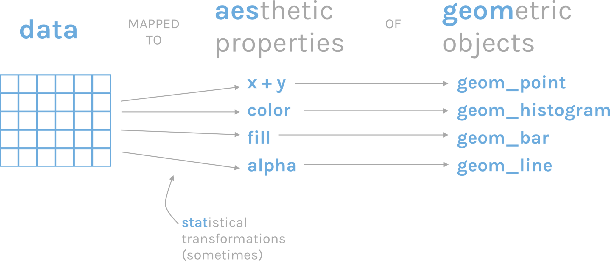
Doing a good graphic involves data and creativity. However, there are certain common elements behind the creation of a graph that we can sum up as the grammar of graphics Wickham (2010). Graphics are constructed by combining independent components, such as data, aesthetics, geometries, and scales.
The package we will be using to make plots in R is called ggplot2, and its syntax is based on this grammar of graphics. In ggplot2, a plot is constructed by starting with a layer of data, and then adding additional layers to specify the aesthetics (e.g., color, shape, size) of the plot, the type of geometry (e.g., point, line, bar) to use to display the data, and the scale (e.g., linear, log, discrete) to use for each aesthetic. Each of these components can be modified and customized in a variety of ways to create complex and informative visualizations.
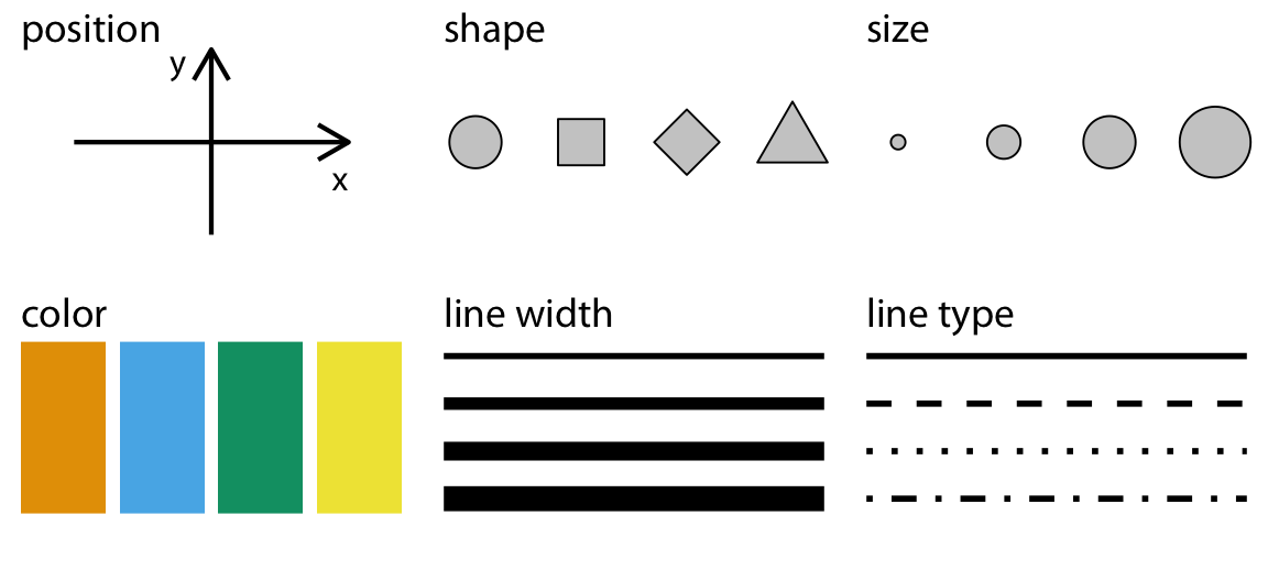
This process of assigning data variables to the visual properties of a plot is called mapping of aesthetic attributes. In other words, it is the way to show in a visually perceptible way the difference between values. Aesthetics refer to visual properties such as color, shape, size, transparency, and position that can be used to visually represent data.
The grammar of graphics approach allows users to create a wide range of plots, from basic scatter plots and histograms to complex multi-layered visualizations, using a consistent and intuitive syntax. It is a powerful tool for data exploration and communication and has become a popular approach for data visualization in the R community.
Types of graphs
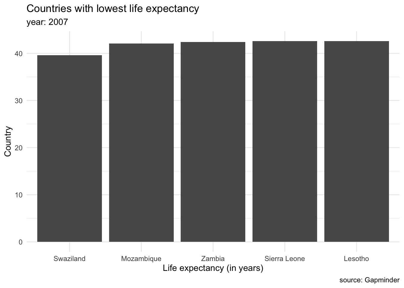
We can group plots into various clusters according to the kind of data we want to show. We will often be interested in showing the magnitude of numbers: the total number of people living in different countries, the mean salary for different groups of populations. These cases have a set of categorical values (such as countries, or demographic groups) and a quantitative value for each category. This is the same as saying we are going to show amounts (Wilke (n.d.b)). The most common graph to showcase amounts are bar plots. For example, we can display the countries with lowest life expectancy in the year 2007.
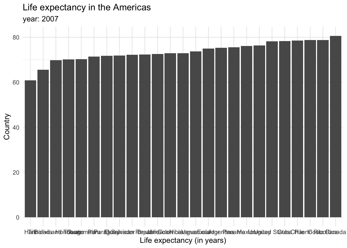
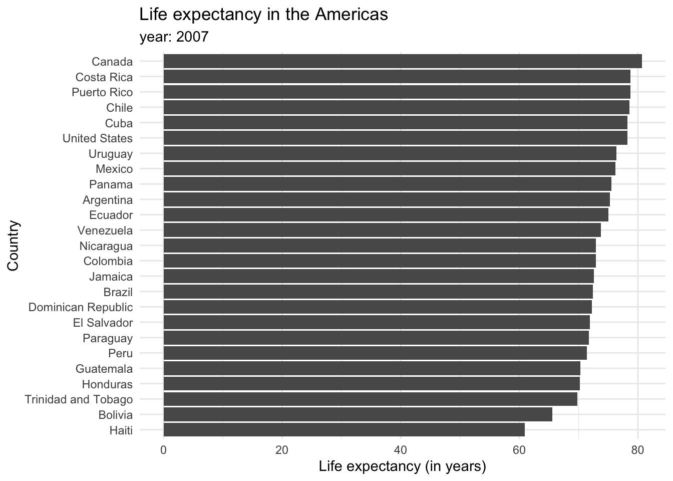
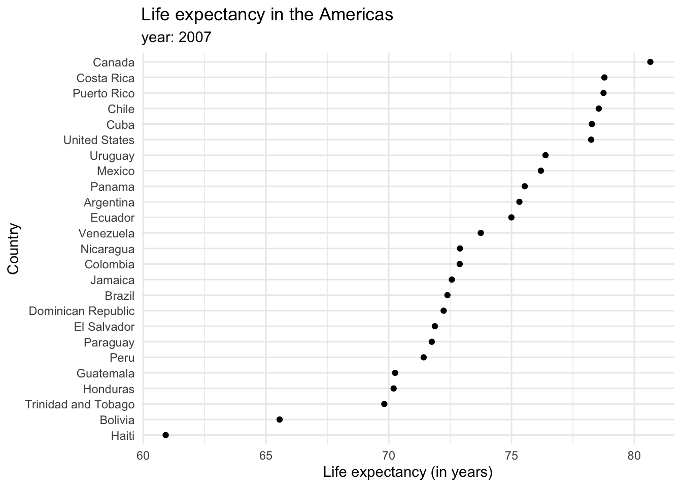
Each bar represents a categorical variable, and the length represents the quantitative value. Bars can be arranged either vertically or horizontally. By convention, when there are not many categories, vertical bars are the best option. But when one is working with many categories, the names on the horizontal axis might overlap, so displaying the values in the y axis is a better idea. Take a look at how the life expectancy ages in 2007 for the Americas would look like in a vertical axis…
and in a horizontal one.
Bar plots tend to be the most common kind of visualization due to their effectiveness. Pretty much anyone can interpret them, and simple, easy-to-understand graphs are a key of data visualization. However, reusing them over and over in the same document might be repetitive and lose a reader’s attention, so it is also good to keep in mind other alternatives. For example, dot plots provide a cleaner graph by only showing a point where the bar would end, removing the “insides” of the bars. This minimalist approach is often considered synonymous with a good plot in the data visualization community. Expanding our knowledge of different types of graphs and their uses can keep things interesting and enhance the clarity of our data representation.
So far, we have seen examples showing values for individual groups. However, in other cases we might be interested in showing how some group, entity, or amount breaks down into individual pieces that each represent a proportion of the whole. Common examples include the percentage of races in a group of people (45% of the population in this neighborhood is black, 40% is white, 10% is latinx and 5% is asian) or the percentages of people voting for different political parties in an election (60% of the population voted for X candidate, while 40% voted for candidate Y).
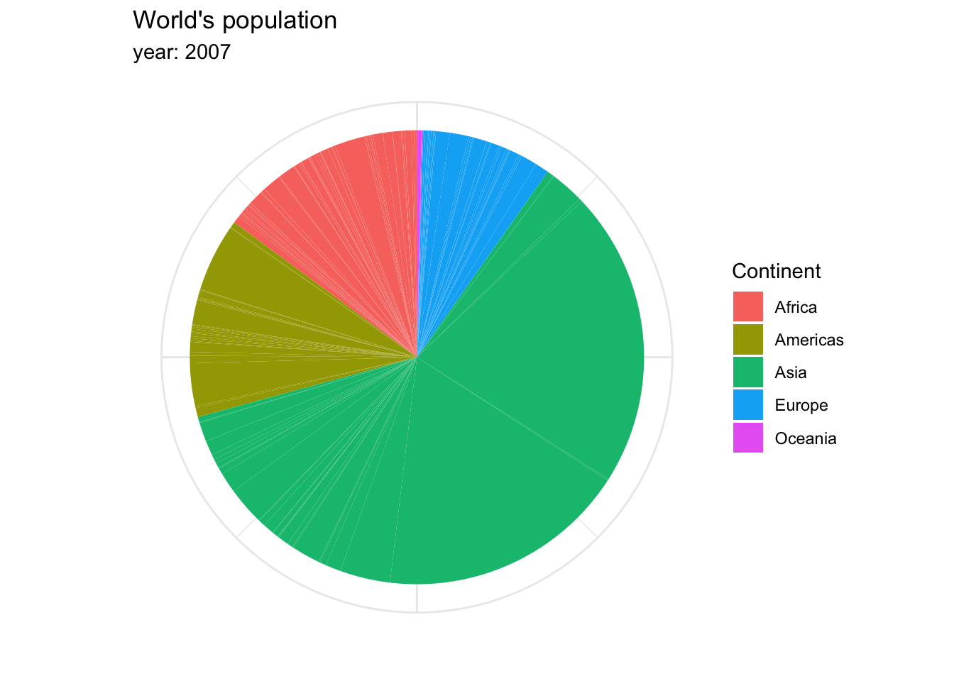
The archetypal visualization for this kind of information is the pie chart, where each group is displayed as colored areas inside of a circle. However, over time, this graph has gained quite a negative reputation. While it is very popular, it has been shown that the human eye understands proportions more easily when they are displayed vertically. Take a look at the proportion of people in each continent represented within the world’s total population in 2007, in a pie chart…
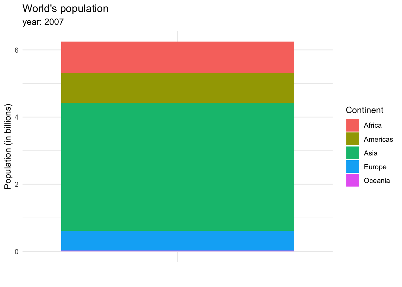
or in a stacked bar chart.
The stacked bar chart shows more clearly the weight each continent has on the total population of the world, and allows us to see a small line representing Oceania, which wasn’t visible in the bar chart.
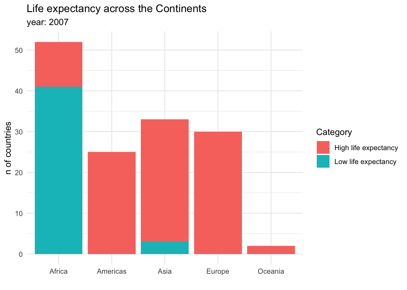
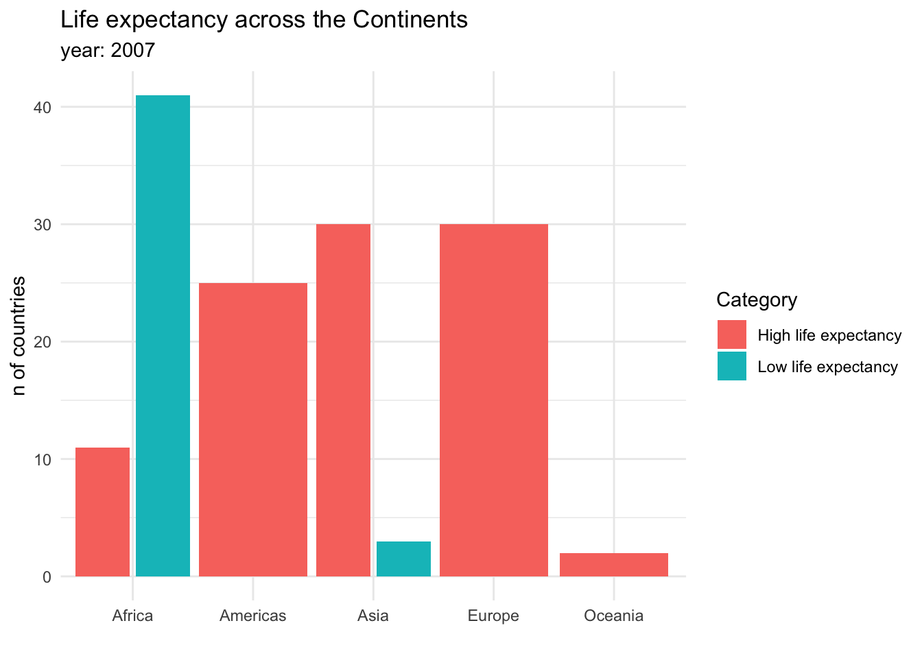
Visualizing proportions can be challenging, specially when the whole is broken into many different pieces. That is to say, when we want to see the values for sub-groups inside of our groups. And this is specially useful when we want to control how a variable changes by different groups. For example, we could be interested in the amount of countries that have a high or a low life expectancy across continents. This could be done in a stacked bar chart:
Stacked bar charts are useful for showing absolute values within the larger groups. It is clear from this graph that Africa has the most countries, but also that the majority of them have a low life expectancy. Another option to show this information would be a dodged bar chart, where the subgroup bars are positioned next to each other rather that on top.
In this case, there is no clear answer to which kind of plot is better! Data visualization is a field where scientists should explore and try out different options to decide which one suits the case better.
So far, we have worked with the simplest kind of visualizations: counts or proportions. However, as we dive into the analysis, we might be interested in checking out how a particular variable is distributed in a dataset. That is to say, how the variable is spread: which values are more common and less common, which are extreme values, and so on.
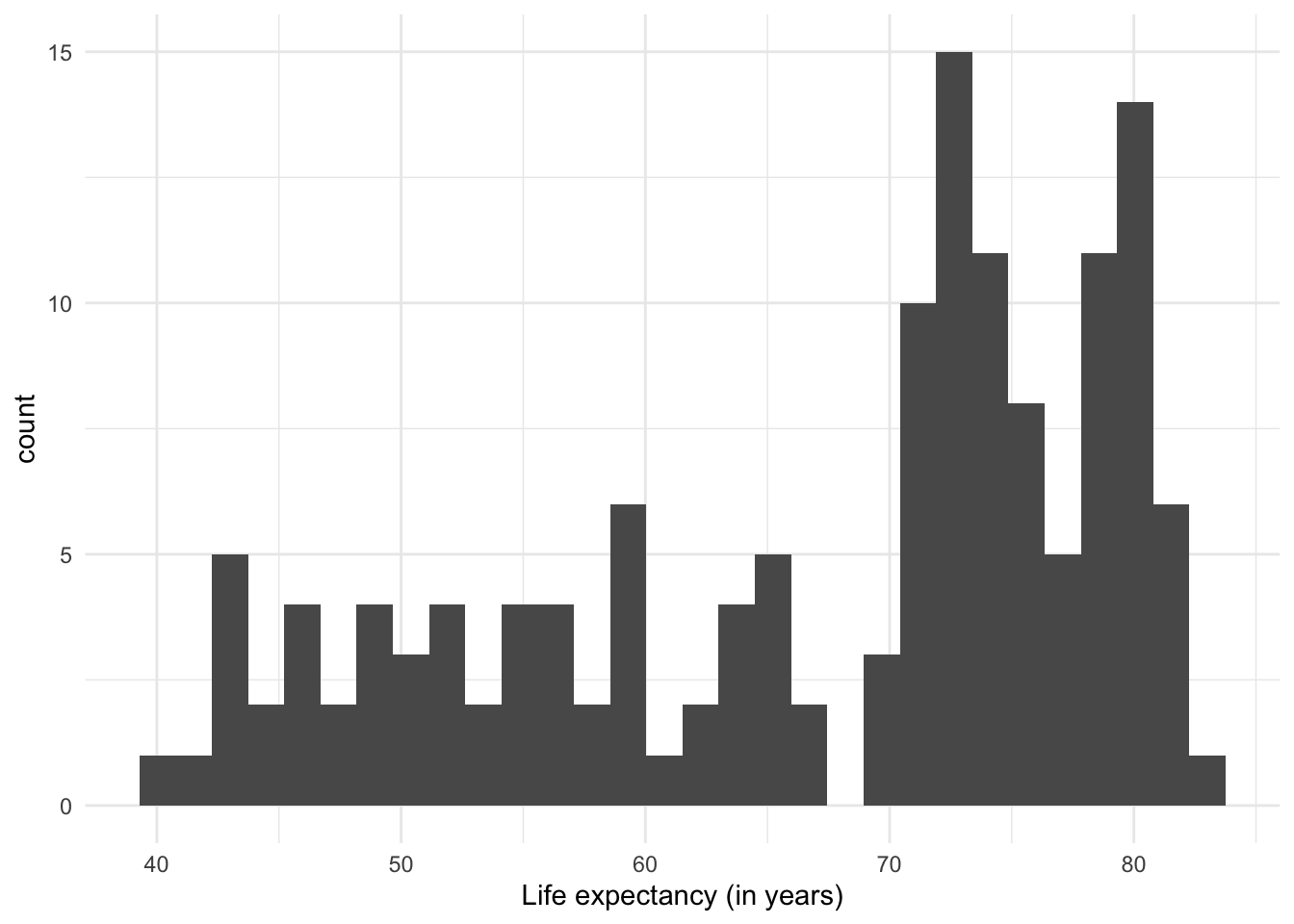
The most common visualization to show distributions is the histogram, which in practice is a variant of… the bar plot!
The histogram shows the range of values (from the minimum to the maximum that they reach), and how often they are observed in each range.
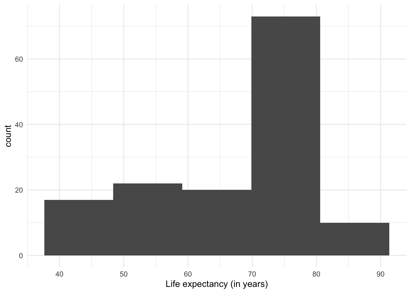
One thing to note about histograms is that their appearance (and therefore the message they convey) can change depending on the number of intervals used. The previous plot had divided the range of values into 30 ‘bins’ or equal intervals (e.g. ‘0-10’, ‘10-20’, etc.) and counts how many observations fall into each one. We can increase the level of detail in the histogram by increasing the number of intervals, at the cost of losing generalization. Conversely, if we reduce the number of intervals, we show a more summarized distribution of the data, at the cost of losing detail.
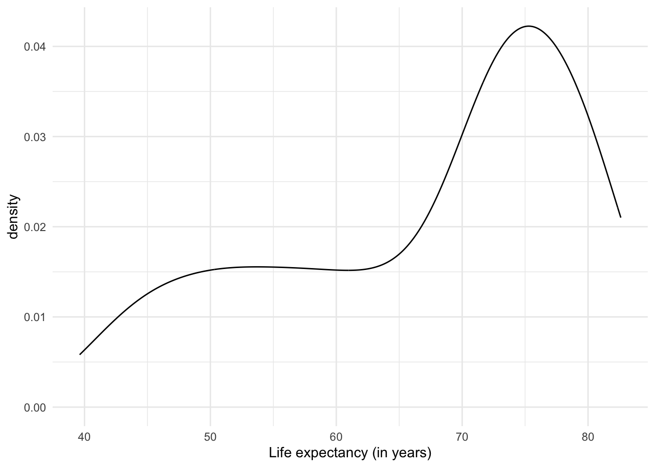
Another option to plot distributions are density graphs. Density plots are direct descendants of histograms. But instead of counts of observations per range of values, they show the probability distribution of the variable, i.e. how likely it is to find a particular value if we randomly selected one of the observations. Unlike histograms, which have been in use for a couple of centuries because they are relatively easy to create by hand, the (previously) laborious density plots have become popular with the advent of software and computers capable of creating them instantly.
The results of density plots are interpreted similarly to those of a histogram: we notice the range of the data and how common they are in one range compared to another.
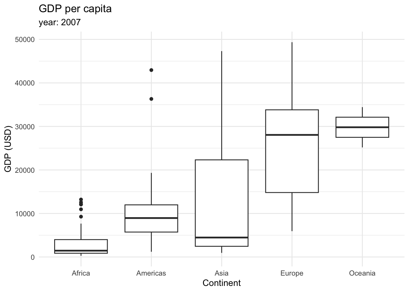
Finally, we can plot distributions as boxplots (also called box and whisker plot). It displays a summary of the minimum, first quartile, median, third quartile, and maximum values of the data. First, let’s take a look at the following boxplot that displays the GDP per capita across continents in 2007.
This type of graphic contains a lot of information.
The box in the middle represents the middle 50% of the data, with the lower edge representing the first quartile (25th percentile) and the upper edge representing the third quartile (75th percentile).
The line inside the box represents the median.
The whiskers extending from the box show the range of the data, typically defined as 1.5 times the interquartile range (IQR), which is the distance between the first and third quartiles.
Outliers, which are data points that fall outside the whiskers, are shown as individual points.
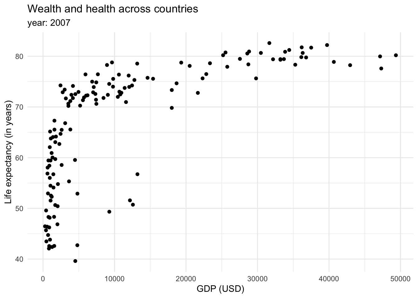
Finally, we could be interested in showing the relationship between variables (x-y). The most common way to show this is through scatterplots.
Mapping more aesthetic attributes
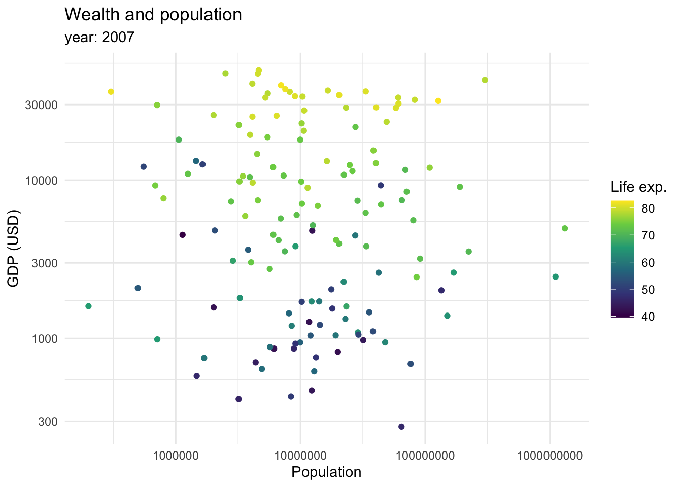
So far, we mostly saw how data can be mapped into an x and y axis. However, we mentioned we can also map data as shapes, sizes and colors. We briefly saw how color can be introduced to show categorical variables when we are seeing proportions of the data. However, it can also be used as a continuous variable.
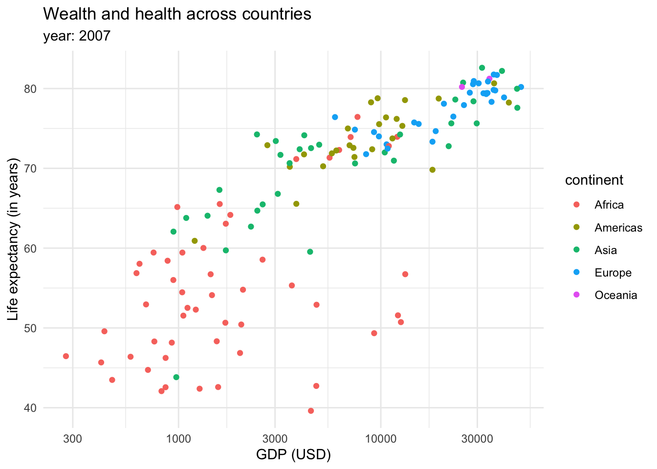
This graph shows that there is a relationship between longevity and GDP: countries with higher life expectancy are found at the top of the graph. As we continue to explore this relationship in the following plots, note that we also introduced a transformation on the X axis. We can see that the values in the scale go from 1,000,0000 to 10,000,000, and then to 100,000,000 until 1,000,000,000. This is called a logaritmic scale: the values are no longer evenly spaced, they increase exponentially. This is specially useful when we are working with data with a wide range of values, such as populations or income. For example, let’s introduce the variable continent into our ‘Wealth and health’ graph with a logarithmic scale in the GDP variable.
This returns us a more clear and compact graph, where we can better see the variability in the lower values for both variables, and relate them mostly to Africa.
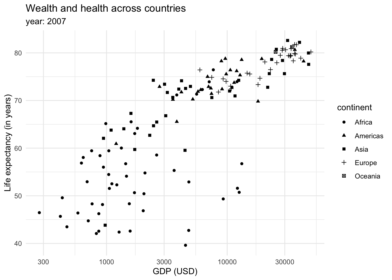
We could also show the continents as shapes:
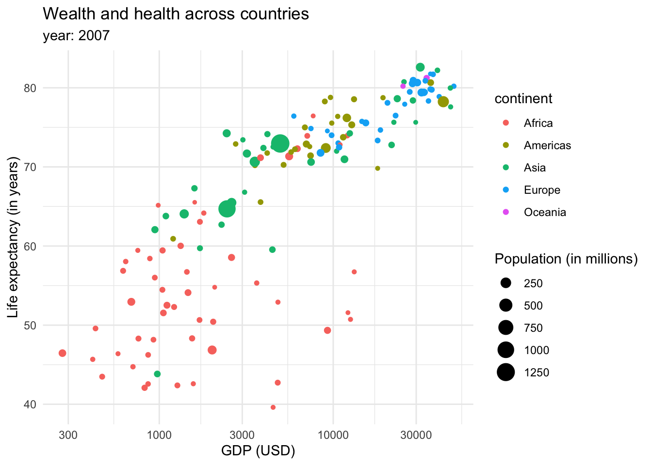
However, the color tends to be a better option to plot categorical data. We could also introduce more data into the plot through the size of the dots or shapes.
